Solutions for Mobility
Responsive & Mobile Design
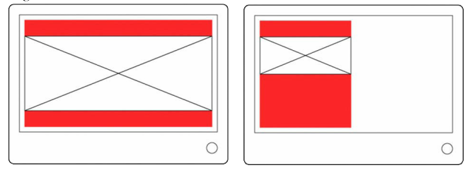
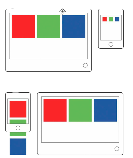 Responsive Websites enable a website to adapt to the different screen sizes of various devices such as personal computers, tablets and smartphones simultaneously. Thanks to the explosive growth and variety of mobile devices, responsive websites has become a very important trend.
There is a big difference between the screen sizes of a desktop computer and a smartphone, and users will experience significant difficulties if your website displays the same layout for each device.
Elemental Maze Web Solutions uses a flexible and state of the art mobile framework to construct most mobile websites. Yes, this website is mobile friendly!